Sotheby's Nineteenth-Century Auction Deserves a Good Look and Read
I spent Sunday afternoon at the preview for Sotheby's 19th Century European Paintings auction in London. (The auction will take place on May 30, together with nineteenth-century Scandinavian works.) I was so overwhelmed with the quantity and quality of paintings, that I went back this morning to take a second look.
While there, I had a wonderful time with Adrian Biddell, Head of the Nineteenth-Century Department, Claude Piening, Senior Director, and the specialist Marta Enille. They were each generous, showing me their personal favorites and sharing a wealth of information that, due to other considerations, cannnot fit into an auction catalog.
In a classroom setting, I once asked well-respected scholar what the difference between a museum catalog and auction catalog is. Her answer: "Length." Several of the pieces at the auction merit the kind of in-depth, drawn-out study than an auction catalog (or blog) can't give. For my part, I hope that many of these paintings resurface after the auction in order to be seen and written about at greater length.
I have pictured a few pieces here that I liked. They are not all the most highly valued ones at the auction, but they set off a spark in me.
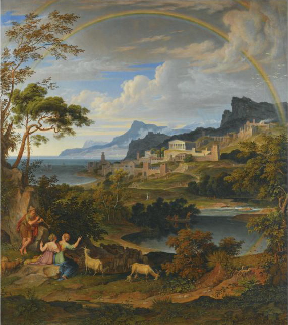
Heroische Landschaft Mit Regenbogen (Heroic Landscape with Rainbow) by Joseph Anton Koch (42 3/4 X 37 3/4 in.)
In Heroische Landschaft mit Regenbogen, as in his other heroic landscapes, [. . .] Koch showed that neoclassicism could and should seamlessly blend into Romanticism and have ideological motivations. The picture spirits the viewer into a timeless, bygone realm populated by shepherds and shepherdesses.
This is the last of four copies of this painting by Koch. The other three are in major museums.
Far from being his premiere pensée, it was painted over a decade after the first version. Instead of spontaneity, it shows a mature structure not found in the other three.
As in Poussin's work--a comparison made by Piening in the catalog--the viewer is carefully drawn into the depth of the painting and shown around through visual devices (e.g. paths, figures, mountain slopes) that makes it difficult to look away. The clouds mimic the hills, which mirror the buildings.
While the composition shows lessons learned from Poussin and Claude, the rich coloring borrows from a Northern European tradition seen in landscapes by Rubens and Brill.
It is a wonderful and strange combination of the two traditions, Classic and Northern landscape.
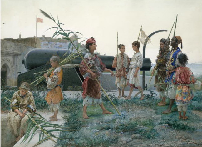 The Presentation by José Tapiró (Spanish, 1836-1913) 19 1/2 X 27 1/2 in. watercolor and gouache on paper.
This is not a major painting by a major painter, but it sings. It is one of many Orientalist paintings and sculptures at the auction.
The painting depicts a group of young boys pretending to be guards with shaved branches instead of guns. It appears to be fun and games until a canon in the middle ground of the painting indicates that they are on the ramparts of a defended city.
It is beautifully composed and technically stunning, reflecting Tapiró's academic training in Reus, Barcelona, and Rome.
Each boy tells a story in his face. While looking at it, I found myself remembering childhood friends I thought I'd forgotten, but who just needed a little prodding from this piece to float back to the surface.
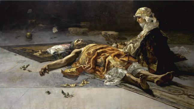 The Watchful Eye--The Vigil by Salvador Sánchez Barbudo (Spanish, 1857-1917) 58 X 100 1/2 in.
This is another Spanish painter who studied in Rome.
It is the kind of painting that an interior designer would find difficult because it is not, as one once told me, "optimistic." This is a painting where the artist's skill is immediately evident.
I have to admit that I feel very little emotional connection to this painting. For my part, the title gives too little information to make the narrative clear, but the subject isn't interesting enough to make me curious about much else than the composition.
I was totally fascinated by its construction. As Marta Enille pointed out to me, the woman is beautifully done. But it is the sprawled-out figure of the man that fascinates me. The difficult, angular pose of the unconscious man and woman in profile could easily have been done another way or less convincingly. It seems effortless in person.
It is perfectly large painting. Any smaller and it would have made the sprawled figure of the man unconvincing; any larger and he would have seemed unreal.
 David Apres le Combat (David After the Battle) Jean-Antonin Mercié (French, 1845-1916) 44 in.
According to the catalog, this work was:
modified during [Mercié's] sojourn in Rome at the French Academy and was undoubtedly an extremely bold statement which begged comparison with seminal works of the Renaissance by Verrocchio, Donatello and Michelangelo. However, Mercié's youthful hero, with his effete charm and overtones of orientalism, could never be mistaken for a Renaissance work. It was exhibited at the Salon of 1872.
The picture hardly does it justice. In person, I felt refined in its presence. Rather than effete, it seems regal, serene.
It seems to me that every narrative has its own convincing medium. This is yet another proof that David and Goliath is best seen in 3D.
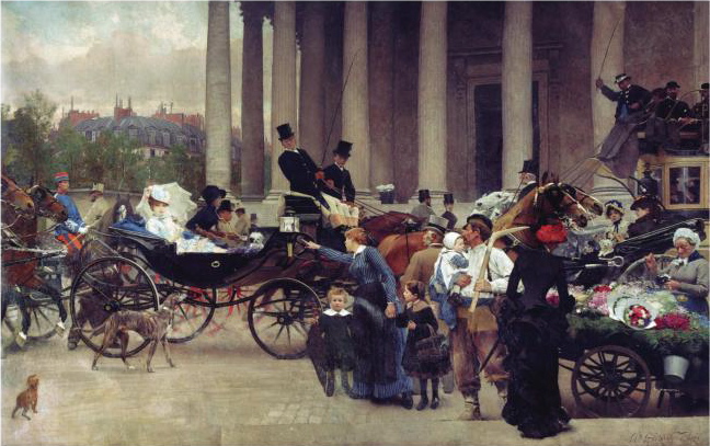 Les Deux Soeurs (The Two Sisters) by Charles Giron (Swiss, 1850-1914) 172 X 248 3/4 in.
Of all the paintings I have seen this year, I was least prepared for this. I spent over an hour dwarfed by it. It is nearly 15 feet tall and 21 feet long with figures in actual scale. As a result, the viewer is appropriated into the painting without need for imagination.
It needs to be seen to be believed.
According to Claude Piening, who researched the painting for the sale, it showed in the 1883 Paris Salon "causing reams of commentary" at the time.
This painting could be subtitled "the beginning of the end of history painting." It is done in the scale of classical history paintings championed by the Ecole des Beaux-Arts, even at this late date. The background features classical columns, but the scene is entirely contemporary -- real people in everyday clothing and events.
The central narrative is of two sisters, one with three children and a husband obviously accustomed to manual labor and the other sister in silk clothing and a horse-drawn carriage. The poorer sister shoots an accusatory finger towards the other, as if publicly calling her out as a girl-for-hire.
No one but the two women and the husband seem to understand the deep emotional nature of the moment. The flower woman, in a masterfully painted effect, holds a string in her mouth as she ties a bouquet for a customer, the traffic continues its pace, and the children seem to be unaware of the conflict.
I have contacted several people about this painting in hopes that, at least, I can find it an appreciative home with visitation rights.